
 Dear Friends,
As we complete our year of celebration, Juniata’s 150th anniversary has offered many opportunities to honor the legacy of learning, sustained by the generations who followed, while also reflecting on who we are today and where we are headed.
In this issue, you will read how Juniata is engaging generative artificial intelligence tools thoughtfully and intentionally. Our faculty and students are exploring these tools not as substitutes for thinking, but as resources that must be guided by judgment, creativity, and ethical reflection. This work reflects a broader commitment to preparing graduates who are not only technologically capable, but also critically aware and socially responsible.
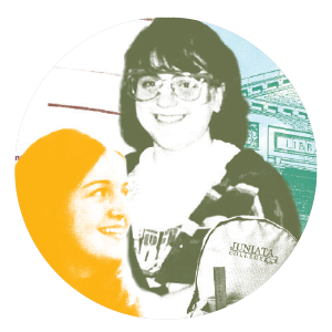
That same shared spirit of purpose is reflected throughout these pages, from students pursuing excellence in the classroom and in their communities to faculty and alumni whose work extends Juniata’s values far beyond campus. Just as the Class of 1915 created the College’s first yearbook to stay connected with one another and with Juniata, today’s students navigate a digital landscape with the same intention. Across 150 years, the College has remained rooted in purpose: to help students learn how to think, how to engage with others, and how to lead with integrity.
Thank you for being part of this continuing story. Together, we honor the values that define Juniata while embracing the opportunities that will shape its future.
James A. Troha, PH.D., President
Digital Exclusive: Behind the Cover
From concept to camera: combining human sketches and AI to fast-track photo direction before stepping behind the lens.
By Tracy Kretz, Executive Director of Strategic Marketing and Brand Design
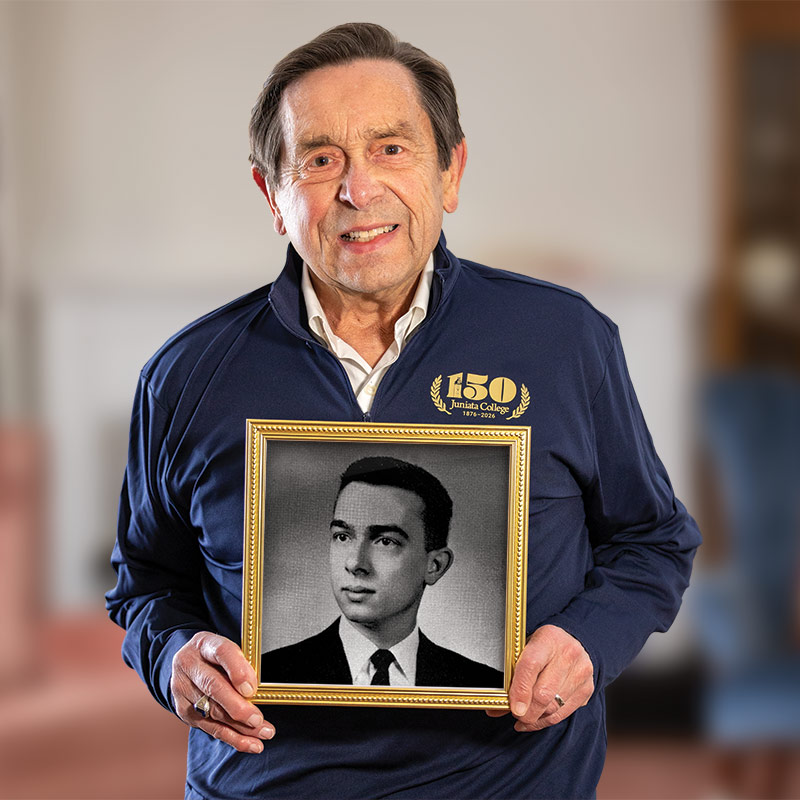
The photograph on a magazine cover is the first handshake with the reader. Getting it right matters — and that work starts long before Nate Ulrich photographs our subjects.
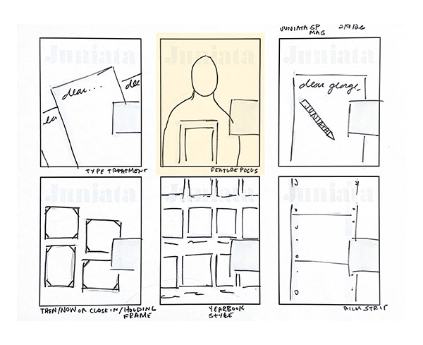
My process always begins with sketches. Black Paper Mate® Flair pen, dozens of concepts, no attachment to any of them — but maybe a little intuition as to which is going to be successful. At this stage, I’m not thinking about surface details. I’m focused on the shape of the idea.
From there, I move into rough digital compositions to test the concepts visually. Earlier in my career, this phase could cost hours — sometimes days — of compositing stock photography or staging reference shoots to communicate a direction. While a refined sketch may be useful to start the conversation, I’ve found that higher-fidelity mockups create better discussion. People react more strongly to something they can see than to something they must imagine.
One discipline I’ve built into my process: I try not to make concepts too real too early. An overly finished mockup can anchor people to details that won’t survive the final photography or storytelling. The goal at this stage is traction, not polish. In this case, the AI generated image was more polished than I intended, but it did the job.
For the Spring 2026 issue, the MarCom team decided to lead with “Letters to My First-Year Self” — alumni writing to their younger selves about what they wish they’d known. The story is deeply human and nostalgic, and that’s where I started. I pulled phrases, themes, and emotional cues directly from the letters and used them as creative ideation prompts.
Rather than spending days building traditional composites or staging photo shoots, I used a workflow using AI image generation. The direction was entirely human: built from my sketches, references, and art direction vocabulary. AI accelerated the visualization.
The exploratory mockups took just over an hour — from prompt architecture to image generation. Using traditional compositing methods (for multiple concepts) would have taken days. Beyond the time savings, this technique changed what was possible in the room — the team could react to ideas earlier, refine direction faster, and align around a concept with clarity. Below, I’ll review how I generated the selected winning cover concept.
The Tool and Prompts
I started by talking it out (voice-to-text, stream of consciousness), then tightened the transcript and used ChatGPT to convert it into a polished image prompt for rapid prototyping.
Prompt:
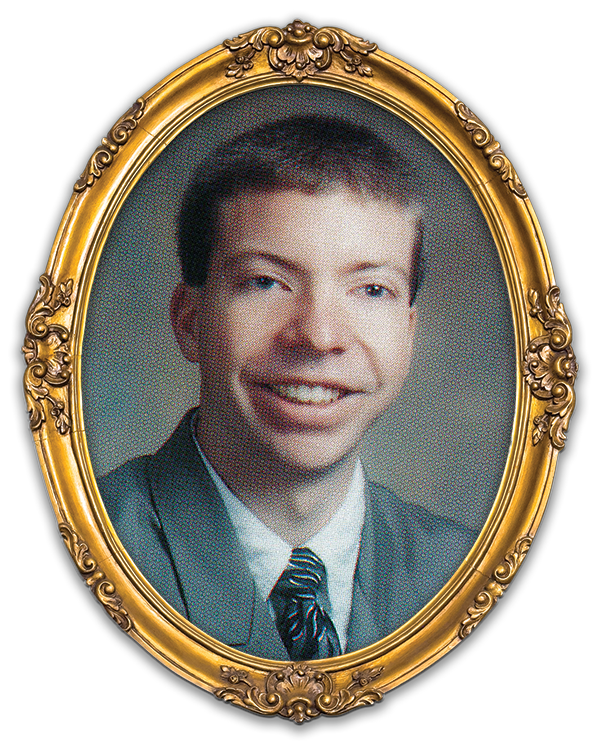
Create a photorealistic, editorial-style magazine cover photograph in a vertical 8x10 (4:5) aspect ratio, matching the composition in the sketch (masthead area at top, subject centered/left, open space on the right for cover lines). Use the attached reference image for composition direction.
A Caucasian man in his 70s stands facing the camera from the waist up. He has short gray hair, glasses, and a warm, proud smile — the expression of someone reflecting positively on the education that shaped his life. He wears a solid navy blue polo shirt (no visible logos).
He is holding a large, ornate gold picture frame with a wide, decorative border. His hands/arms are positioned from the bottom of the frame, holding it close to his torso (secure, natural grip; frame centered in the lower third of the image). The frame is in color and clearly detailed.
Inside the frame is a black-and-white yearbook portrait of the same person as a first-year student — a younger version that resembles him closely (matching facial structure, recognizable eyes/smile). The yearbook portrait is a classic school photo: head-and-shoulders, simple backdrop, slightly vintage tone, but still crisp enough to read as a formal yearbook image.
Background: softly blurred (shallow depth of field), calm and not visually busy — a neutral indoor or campus-adjacent setting with subtle, indistinct shapes/colors. Lighting is soft and flattering, natural feeling, with clean, realistic skin tones. Color grade should feel warm, optimistic, and modern (true-to-life, not overly stylized).
Cover/layout constraints (important):
- Leave clear negative space on the right side for typography (cover lines), without distracting objects.
- Keep the subject’s head below the top safe area to allow for a masthead.
- No text, no watermarks, no extra people, no duplicated frames, no distorted hands or warped borders.
Sketch Ideation and Reference Images
The Results
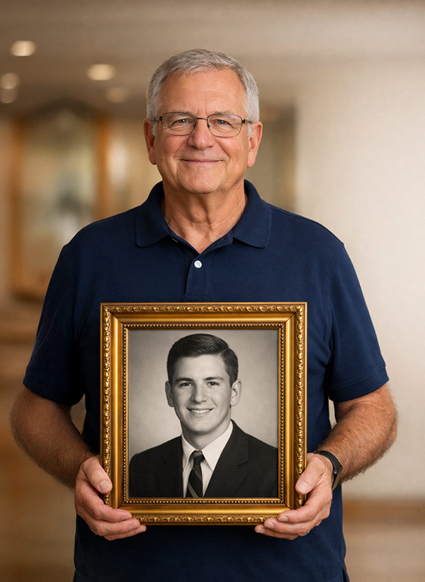
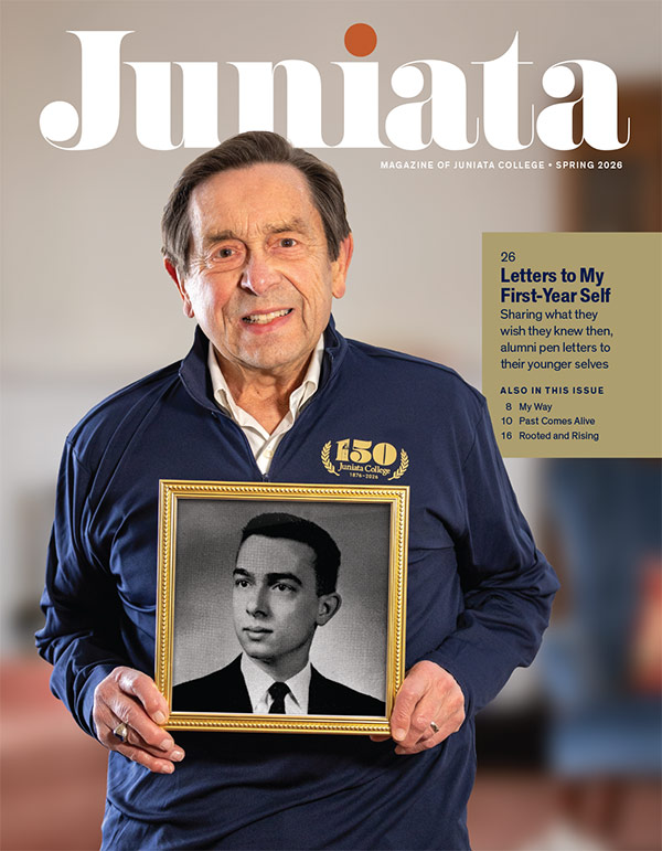
This image is one of three concepts presented to the team. It was the winning direction.
What you’re seeing side by side tells the story: an AI-generated composite used to align stakeholders on a concept, and the actual photograph that came out of the photoshoot. The resemblance to the original conceptual intent isn’t a coincidence — that alignment was the goal from the start.
The composite didn’t just win the room — it went to work. I used it to brief Nate Ulrich before the photoshoot, giving him something concrete to react to rather than a verbal description to interpret. He could see the framing, the mood, the compositional intent. We even shared it directly with George Fattman ’58 so he understood what we were building toward before he stepped in front of the lens.
That’s the value of this workflow, and it isn’t really about speed. Speed is a byproduct. What this process creates is clarity, agency, and trust. The creative team moves with shared understanding. The subject walks into the photoshoot, knowing what we’re after. The stakeholders have already reacted, refined, and committed. The mockup doesn’t just accelerate the process — it builds the conditions for better work.
What this process reinforced for me is that creativity is not simply making images, it is making meaning. Meaning, both in the crafting and interpretation, require judgment, emotion, and intent. AI can accelerate the process, but it cannot make the work matter. That is and will always be rooted deeply in human creativity.
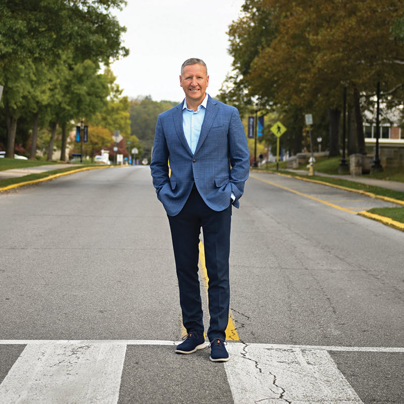
Place
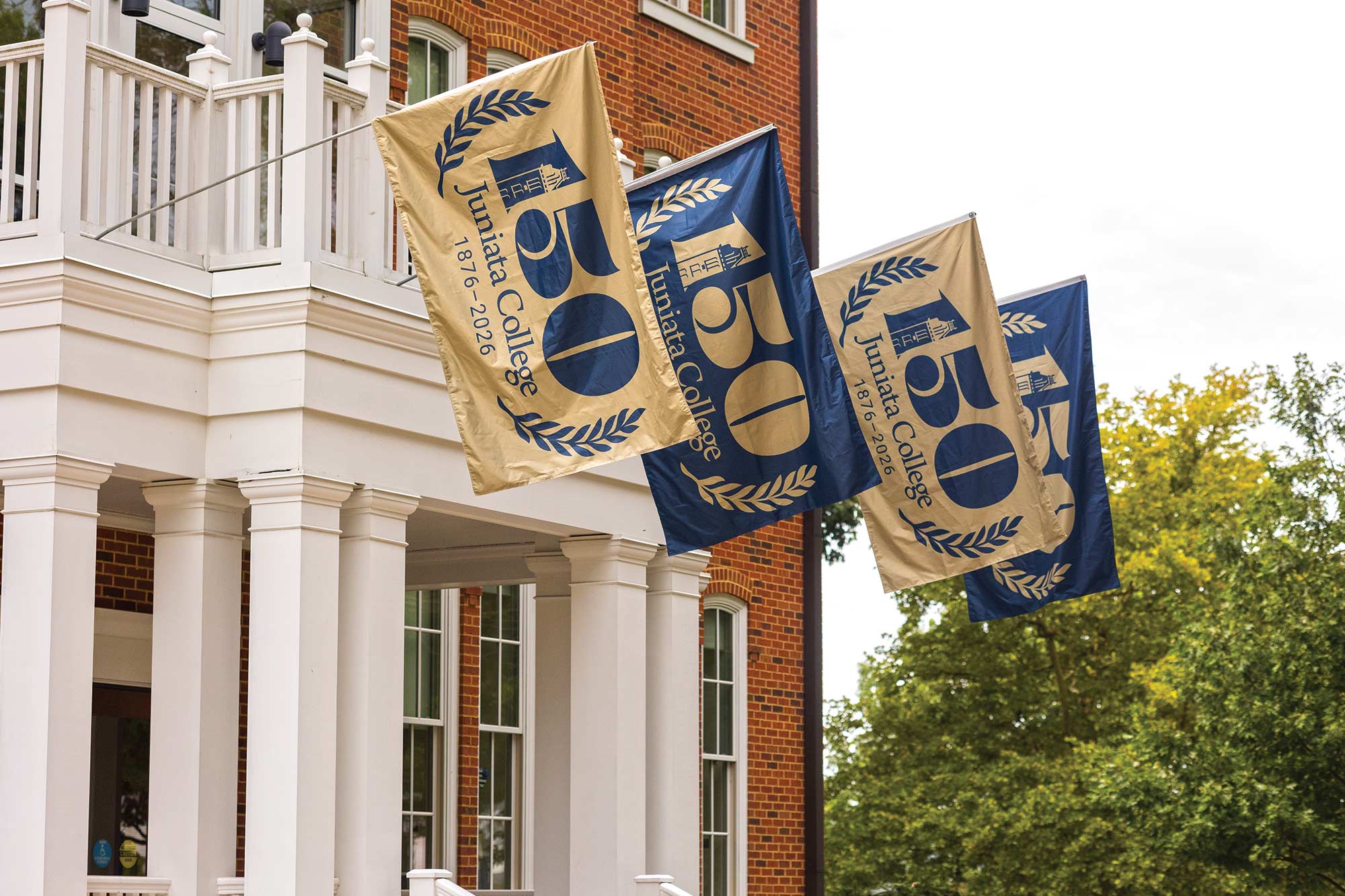
Outside Founders Hall, flags mark 150 years of education, integrity, and service at Juniata College.